May 6, 2013 |
We dove head over heels for these DIY watercolor wedding invitations, stationery and more. This romantic, water-inspired style pairs nicely with a Lake Tahoe lakeside wedding anywhere from formal to casual. With a dash of color and a sprinkle of water, this “labor of love” will surely have your guests diving in too!
xxx
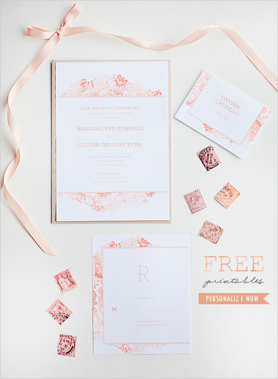 This Petunia printable watercolor invitation from Anticipate Invitations on Wedding Chicks, is in this summer’s popular fresh peach. They also include some oh-so darling tips on how to highlight the watercolor theme throughout your wedding. From brightly painted cookie frosting to dainty, pastel floral napkins… your summer wedding will surely “float” with this unique touch.
xxx
xxx
xxx
xxx
xxx
xxx
xxx
xxx
xxx
xxx
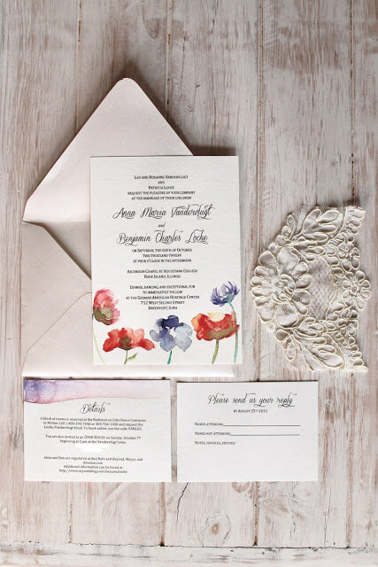 For a more formal approach, this DIY tutorial on letterpress watercolor invitations from Annika Likes is sure to wow. Beautifully hand-painted and customized invitations never seemed so easy!
xxx
xxx
xxx
xxx
xxx
xxx
xxx
xxx
xxx
xxx
xx
xx
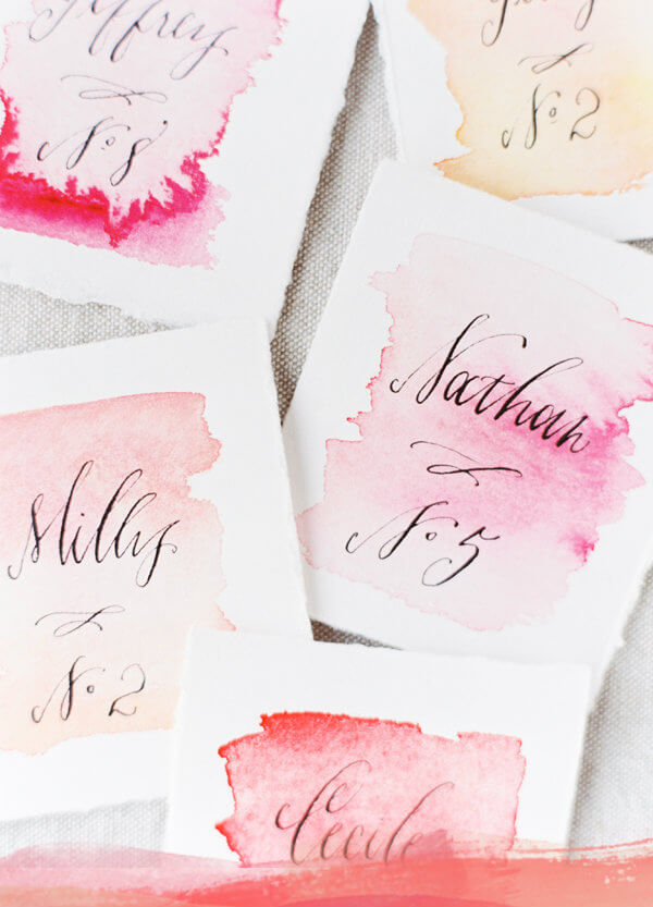 When its time to invite your guests to find their seats for dinner, splash in a bit of watercolor romance to their experience. We loved this DIY idea featured on Once Wed and we just had to share… Definitely steal-worthy!
xxx
xxx
xxx
xx
xx
xx
xx
xx
xx
xx
xx
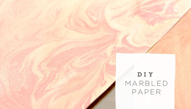 This next idea from Green Wedding Shoes involves a little more “labor of love” than the rest, but the end result is definitely something you and your guests will cherish. With a little acrylic paint, this marbled paper can be used for almost all things wedding from tags to menus to box wraps… Take a look!
xxx
xxx
xxx
xxx
xxx
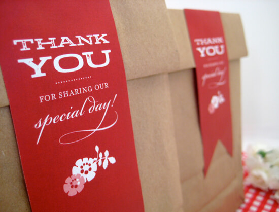 We thought these lovely, quick and easy printable labels for your Welcome Bags, Favor bags and more would be a perfect complement to your lakeside day. Betsy White Stationery Boutique gives us the 411 on how to make this irresistible accessory.
xxx
xxx
xxx
xxx
xxx
xxxxxxxxx
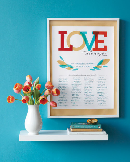 Lastly, but certainly not least, as you create your watercolor masterpieces for your guests, reward yourself with this adorable printable poster to use as your guest book from Martha Stewart Weddings. Then adorn your newlywed home with this piece of art and never forget those that “Love Always” on your wedding day!
xxx
xxx
xxx
xxx
xxx
xxx
xxx
xxx
xxx
Tahoe Signature of Style,
xxx
 xxx
xxx
xxx
xxxxxx
x
xxx
Dec 31, 2012 |
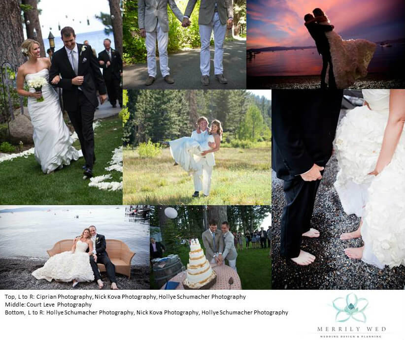
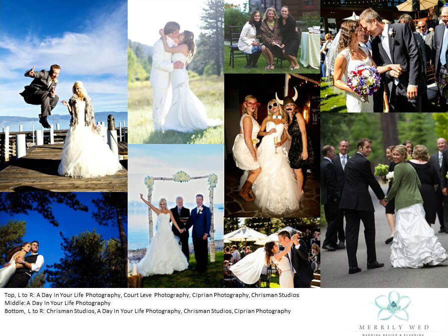
Today we take time to stop and reflect on the year that has gone by, to remember the wonderful new people that came into our lives and to reminisce about the unforgettable life milestones we shared.
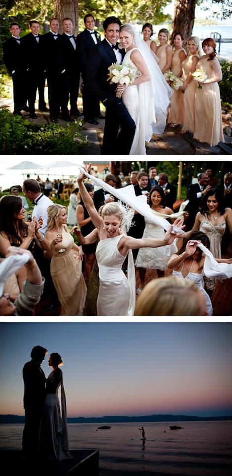
A big thanks to the photographers that don’t hesitate to get dirty lying on the ground or hang one-handed from a ladder or wade into the water up to their waists, risking it all so they can get that perfect intimate look or capture a ravishing glance at just the right angle. Without them, we wouldn’t be able to share a few of these memorable moments and these moments in time would only exist in a fleeting thought…
Thank you to all – our couples, our fellow colleagues – for these moments are a true collaboration of many. Congratulations and Happy New Year!


xxxx
Tahoe Signature of Style,
xxx
 xxx
xxx
xxx
xxxxxx
x
xxx
Nov 7, 2012
Skimming through the thousands and thousands of photos we have of our events through the years, it struck me the range of colors that presented itself. Why not put together a handy dandy little guide to the secret meaning behind each color? Done, and so much fun selecting the right photo to represent each color from our past Merrily Wed weddings…
I never know what colors my next client may fancy and the opportunity to do something new is one of my favorite aspects of my job. Even with the same basic color palette, little twists and adjustments to the lead colors make every wedding different. For example, one year I had two clients with the same color palette and the same wedding day (believe it or not!).
The primary colors were navy and green yet one bride leaned towards kelly green and the other towards a spring chartreuse green. This is where the similarities stopped and the individual personalities of the wedding couples took over.
In fact, both of these weddings were so detailed, original and beautiful, they both landed spots in national and regional publications – Destination I Do Magazine and The knot Northern California Magazine.
This colorful visual guide below will show you what your favorite color means, what it may say about your personality and how the colors you select for your wedding color palette can influence the overall feel of your wedding day.
xxxx
 Red:
Red:
Red is the most intense color of the color wheel. Red stimulates energy as well as increases enthusiasm. Red symbolizes love, passion, courage and rage. Red also emits a sense of protection from anxiety and fears. If red is your favorite color you are passionate, maintain a busy lifestyle, desire strength and may be a risk taker.
x
xxxxx
 Pink:
Pink:
Pink is fun and exciting, some shades of pink can have almost the same energy as red. Red is passionate without being an overly aggressive hue. Pink is the color of happiness. Pink stimulates energy, encourages action and confidence. If pink is your favorite color you tend to be calm, sensitive and sympathetic. You are also compassionate towards others and dislike controversy.
xxx
xxx
 Orange:
Orange, a close relative of red, radiates warmth and energy. Orange stimulates appetite, socialization, as well as activity. If your favorite color is orange you are friendly, confident and full of energy. You balance your life with business and pleasure and enjoy both!
xxxxxx
 Yellow:
Yellow shines with optimism, enlightenment and happiness. Yellow is mentally stimulating and encourages communication. Yellow will increase optimism, energy, as well as spark creative thoughts. If yellow is your favorite color you are creative, intelligent and happiness comes naturally to you.
xxx
xxx
 Green:
Green occupies more space in the color wheel than any other color and is the second most popular favorite color. Green is a large contributor to the colors of nature. The color green is seen as tranquil and refreshing, with a balance of cool and warm hues. Most shades of green are known to be physically and mentally relaxing. If green is your favorite color you enjoy the nature that surrounds you and love spending time in the outdoors. You also enjoy calming your loved ones, as well as helping the less fortunate.
 Teal:
Teal:
Teal has the calming effect of both green and blue. Teal represents sophistication, generosity and creativity. Teal encourages communication as well as creativity. If your favorite color is teal you tend to be sensitive, intellectual, imaginative and charming. You also tend to be self-reliant and independent.
xxx
xxx
 Blue:
Blue:
The color blue is the most common favorite color in the world. Blue is seen as trustworthy, dependable and committed. It invokes rest and can cause the body to produce chemicals that are calming. Not all blues are serene, bright blues can become dramatic and cause exhilaration. Blue is the least gender specific color, it appeals equally to both genders. If your favorite color is blue, friends find you to be very trustworthy and patient. You are also conservative and love to have stability in your life.
xxx
 Navy:
Navy:
Navy symbolizes wisdom, self-mastery and spiritual realization. Navy, being a shade of blue, increases communication within yourself. Navy develops intuition, increases solitude and lets you focus on personal issues. If navy is your favorite color you are spiritual, intuitive and intelligent. You are also self-reliant and tend to take on responsibility.
ccc
xxx
 Purple:
Purple balances red’s stimulation and blue’s calming effect. With a sense of royalty, purple is a color often well liked by very creative personalities. Purple is uplifting, calms nerves, as well as encourages creativity. If purple is your favorite color, you desire respect, power and often tend to be sentimental.
xxx
xxx
 White:
White projects purity, neutrality and cleanliness. The color white encourages clarity and enables fresh beginnings. White also encourages clearing clutter and purifying thoughts and actions. If white is your favorite color, you prefer a peaceful surrounding and like to be surrounded by truth and innocence.
xxx
xxx
 Grey:
Grey:
Grey is the color of knowledge, wisdom and intellect. Grey is also known as the color of compromise because it is a mixture of powerful black and pure white. Grey can sometimes be unsettling because of this compromise, but can also create expectations. If grey is your favorite color you constantly look for peace and composure. You have good business abilities and tend to work hard, sometimes without reward.
 Black:
Black is authoritative, powerful, formal and evokes strong emotions. The color black can create a sense of potential and possibility. If black is your favorite color you are classy and others perceive you as a powerful individual. You are very in tune with your emotions and can be spontaneous.
xxx
xxx
 Brown:
Brown symbolizes stability, reliability and approachability. Brown is the color of earth and is affiliated with being natural and organic. Brown creates a feeling of wholesomeness, stability and orderliness. If your favorite color is brown you are dependable, patient and reliable. You also tend to not like impulse, because you are organized and everything is well planned.
xxx
xxx
 Champagne:
Champagne represents the basics, the essentials. Champagne incorporates the warmth of brown with the crispness of white. Champagne creates a feeling that is calm, relaxing and creates a feeling of simplicity. If your favorite color is champagne, you are conservative, dependable and friendly. You also tend to be a perfectionist and like everything to be precise.
xxxxx
xxx
Colors reveal a lot more than just adding some eye candy to an area or object. Keep in mind that a single description may not fit you perfectly and it may be a combination of colors that describe you best.
You may consider these meanings when selecting the color palette for your wedding to instill the feeling that you desire. More importantly though, just have fun with it! Can’t go wrong with your favorites and your wedding will be a true reflection of yourself!
xxxx
Tahoe Signature of Style,
xxx
 xxx
xxx
xxx
xxxxxx
x
xxx
Oct 17, 2012
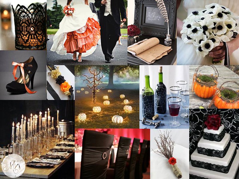
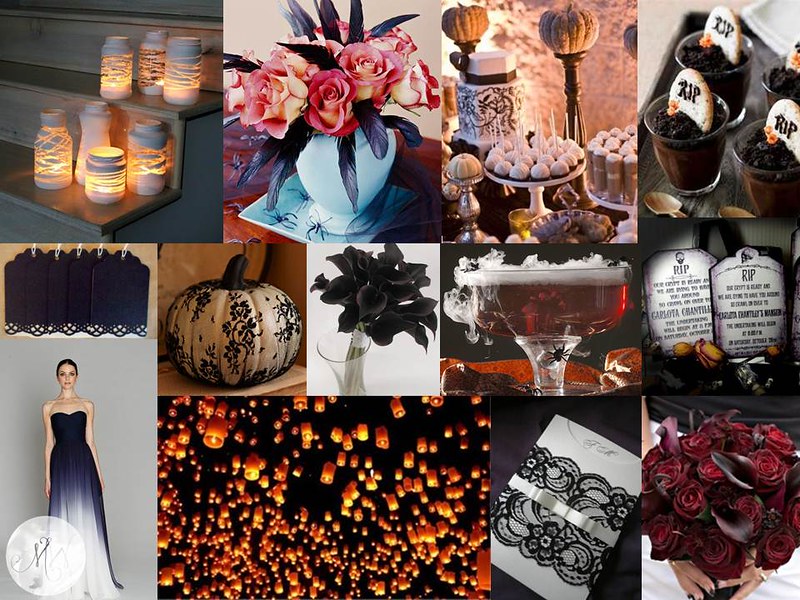
What if you were planning a Halloween wedding? So for fun (since I probably will never plan a real wedding on Halloween or face my son disowning me for missing trick-or-treating), I thought What If?
The challenge is to create an elegant event, and dare we say romantic, without it feeling like a kid’s Halloween party… but at the same time not to completely lose the obvious inspiration of the hallowed holiday.
What if… we used coffins for benches to sit on during the ceremony? What if…. lighted pumpkins lined your aisle?
What if… your flower girl used a pumpkin to toss her petals from?
What if… we used tombstones to direct guests to various vignettes?
What if… we used a smokey cauldron to serve the special drink?
What if… you dyed your crinoline a fall orange? What if… you dressed your bridesmaids in black and white?
What if… we garnished passed appetizers with mini-tombstones monogrammed with your initials?
and What if… for your grand exit your guests released glowing wish lanterns into the Halloween night sky…
xxx


Top Board, Credits from Top Left to Right – ZoesApartmentBlogspot, BrassPaperClip, BHG, HendCyber; Middle Left to Right – ArsenicWitcheryBlogspot, Etsy Artist Ivanna, Pinterest, WomansDay, Etsy Artist AprilHillerDesigns; Bottom Left to Right – Remodelista, JubileeLauEvents, BridalSnob, Juxtapost
Bottom Board, Credits from Top Left to Right – TheForgeStyleBlogspot, BHG, DevaWeddings, Pinterest; Middle Left to Right – Etsy Artist FlourishingAgain, BHG, WeddingObsession, Squidoo, Etsy Artist DamnFrenchDesserts; Bottom Left to Right – Indulgy, ArsenicWitcheryBlogspot, Pinterest, theKnot
Happy Halloween!
Tahoe Signature of Style,
xxx
 xxx
xxx
xxx
xxxxxx
x
xxx
Mar 23, 2011 |
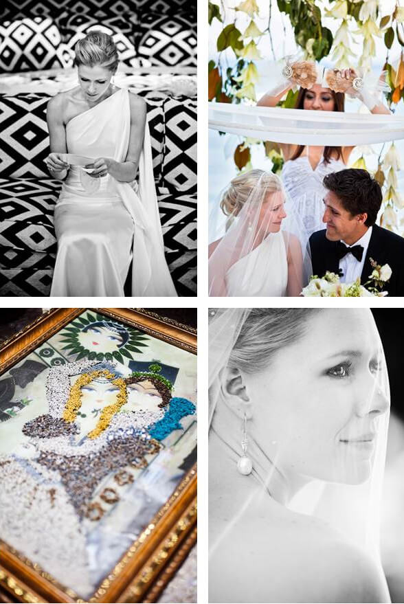
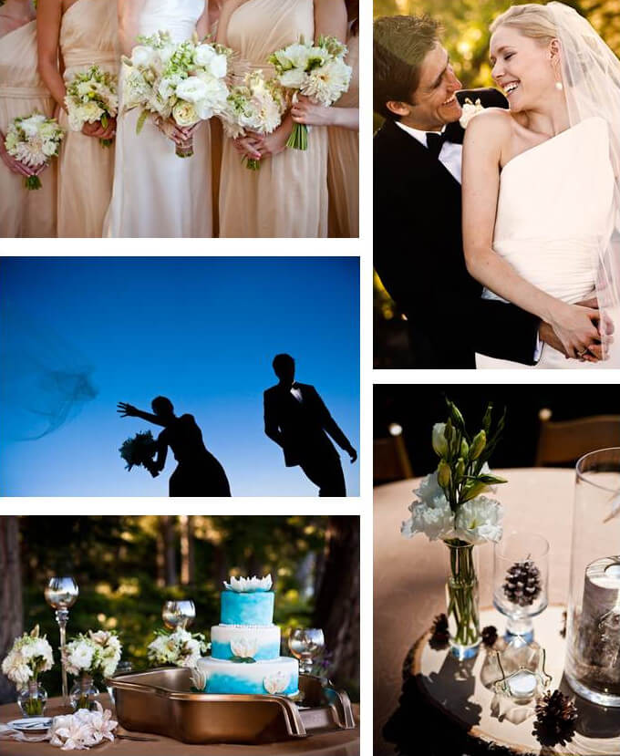
On the cover of Style Me Pretty today, is the sophisticated yet naturally elegant wedding of Natasha and Ali. The complete feature can be viewed here – Lake Tahoe Wedding by Merrily Wed. Natasha wanted a garden wedding and Ali wanted to be married on the shores of Lake Tahoe – both received their wish!
The wedding of Natasha and Ali was captivating to witness in person – a marriage of different cultures (Persian and Western), traditions and families. The love was palpable on their day and here are some of the mesmerizing photos taken by Dave Getzschman that we have been eagerly waiting to share.
Soft yet structured, refined yet rustic and shimmery yet natural details abound! Style Me Beautiful!

xxxx
xxxx
xxxxxxxx
xxxx


 This Petunia printable watercolor invitation from Anticipate Invitations on Wedding Chicks, is in this summer’s popular fresh peach. They also include some oh-so darling tips on how to highlight the watercolor theme throughout your wedding. From brightly painted cookie frosting to dainty, pastel floral napkins… your summer wedding will surely “float” with this unique touch.
 For a more formal approach, this DIY tutorial on letterpress watercolor invitations from Annika Likes is sure to wow. Beautifully hand-painted and customized invitations never seemed so easy!
 When its time to invite your guests to find their seats for dinner, splash in a bit of watercolor romance to their experience. We loved this DIY idea featured on Once Wed and we just had to share… Definitely steal-worthy!
 This next idea from Green Wedding Shoes involves a little more “labor of love” than the rest, but the end result is definitely something you and your guests will cherish. With a little acrylic paint, this marbled paper can be used for almost all things wedding from tags to menus to box wraps… Take a look!
 We thought these lovely, quick and easy printable labels for your Welcome Bags, Favor bags and more would be a perfect complement to your lakeside day. Betsy White Stationery Boutique gives us the 411 on how to make this irresistible accessory.
 Lastly, but certainly not least, as you create your watercolor masterpieces for your guests, reward yourself with this adorable printable poster to use as your guest book from Martha Stewart Weddings. Then adorn your newlywed home with this piece of art and never forget those that “Love Always” on your wedding day!
 xxx
xxx
