Feb 15, 2013
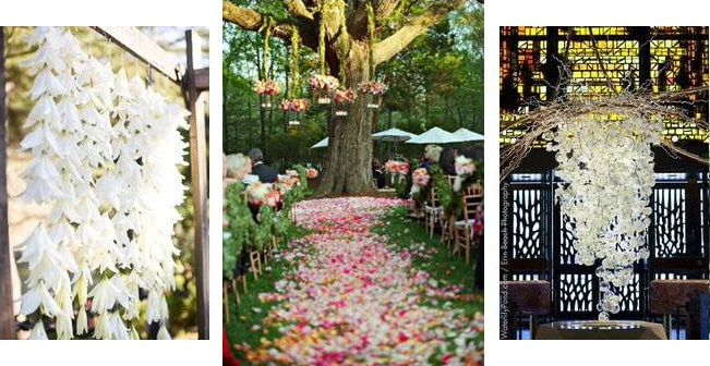
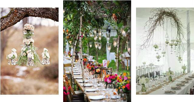
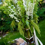
What’s trending up today in wedding design is actually a trend down… So out with the old and in with the new! We just fell in love with the lavish, luxurious cascading flower wedding trend for 2013. This romantic and intoxicating cascade of beauty can be drizzled throughout your wedding from your ceremony to your reception and beyond!
Ceremony Décor
Some couples desire to stand beside the timeless arch to say their “I Do’s” while others dream of exchanging their vows under a traditional chuppah. Then there are those that love being surrounded by a waterfall of decadent flowers swinging from the trees. This cascading flower trend has also beautifully lent itself to include lush greenery or sophisticated swaying linen to accompany the altar area. Wherever you choose to become “Mr. and Mrs.”, this cascading effect emanates true love with a dash of whimsical romance!

Reception Décor
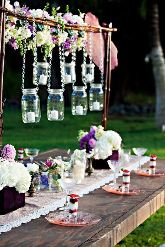
Why not wine and dine under a gorgeous cluster of your favorite dangling flowers, with or without candlelight, for your first dinner as newlyweds? Flowers adorning the chandeliers, twinkling string lights, cascading flowers dancing above the dining tables… priceless!


Beyond!
Okay, so maybe you just want to ‘splash’ some cascading flowers somewhere else in your most memorable day, but not wanting to fully commit to the cascading flowered arch or tablescape? Rest assured, here are some other ways to include the trend in your wedding day!
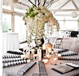
Escort Card Table
This table décor often sets the mood or tone for the evening for your guests’ dining experience. Whether a few small trailing cluster of flowers to welcome your guests to dinner or a decadent cascade of blooms, this is such a delightful touch!
xxx

xxx
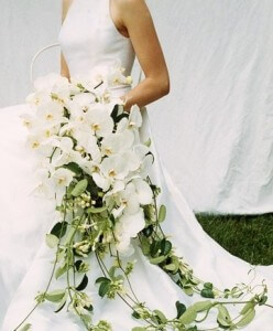
Bouquet
Breathe in this divine classic phaeleonopsis orchid cascading bouquet, such a gorgeous statement piece!
xxx

xxx
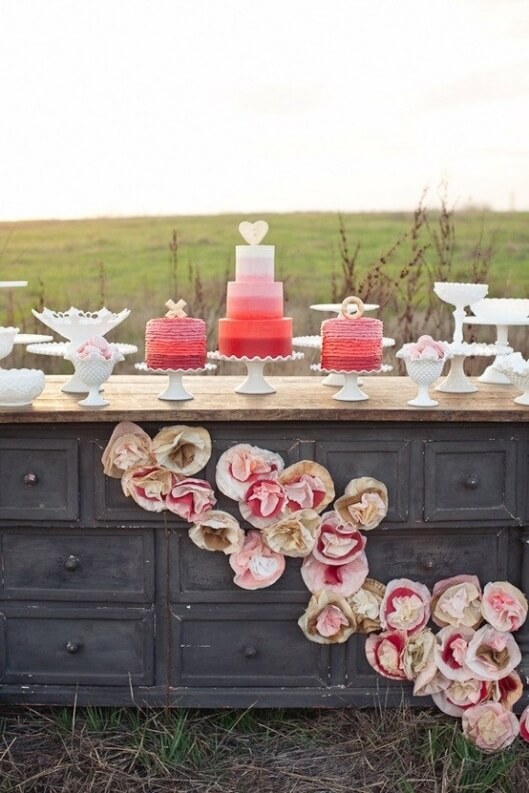
Dessert/Cake Table
Here is a trendy way to incorporate both the cascading effect and the use of ever-so popular paper flowers!

xxx
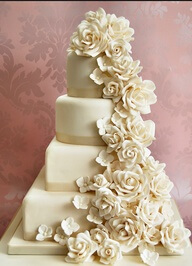
Wedding Cake
The dramatic detail of the cascading flowers will have all of your guests wondering if they should dare take a bite!
xxx

xxx
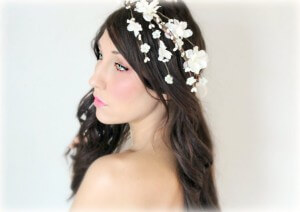
Hair Flowers
A smattering cascade of white blooms can be simple yet elegant.
xxx

So what’s trending up in wedding design is actually a trend down. Cascading, trailing, dangling – anything pulling your eye up or elongating a décor accent. Things are trending up in 2013!
xxx
Tahoe Signature of Style,
xxx
 xxx
xxx
xxx
xxxxxx
x
xxx
Dec 4, 2012
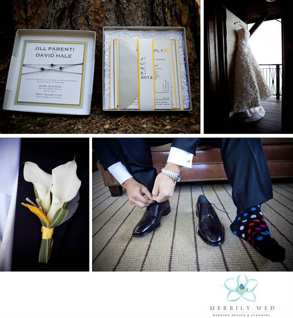
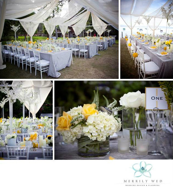
The June wedding of Jill and Dave at the West Shore Cafe kicked off our past wedding season with a bountiful feast of eye-grabbing details thanks to the scrumptious bright yellow Jill is so fond of. Her wedding color palette comprised of bright yellow, pewter silver/grey with whites and creams was sophisticated and current.
Jill and Dave didn’t want anything too traditional with their wedding and strove for a modern, unique yet elegant touch to their special day. Standing together with their closest friends and family seated nearby, all eyes were on them during the ceremony as they opted to not have a wedding party. Another modern change, in leiu of a classic ‘presentation’ wedding cake, they opted for a passed dessert of lemon blueberry mascarpone cake.
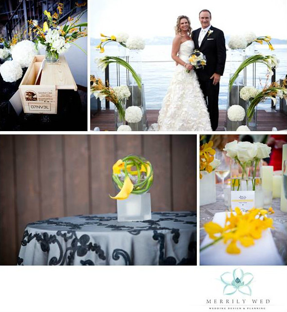
Other current touches included faux paper grey flowers mixed in with the real blooms in Jill’s bouquet. This brought a color and texture spectrum not normally found in nature to the mix – absolutely stunning. The faux flowers could be found as well throughout the reception including the dining table centerpieces.
Floral rosettes cascaded down Jill’s gorgeous gown and this fabric was mimicked in the backing of each formal invite. A fresh bright yellow dot motif was carried throughout from the invites to the reception accessories – all by Angela Dal Bon Custom Invitations and Announcements.

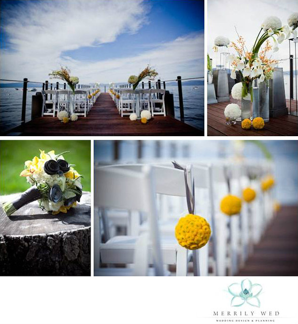
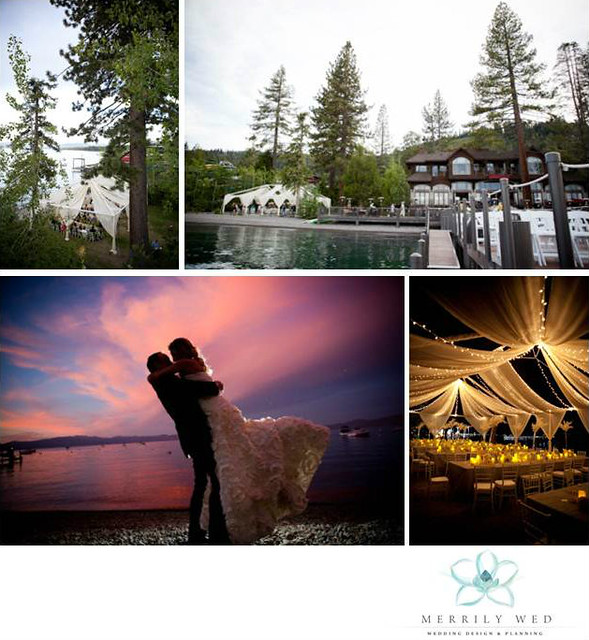
Jill & Dave exchanged vows at the end of a long, dramatic pier. Modern, bold and slightly edgy arrangements on silver pedestals in clear vases elevated the “floating” flowers to new heights and nodded to the Lake Tahoe water just inches away. Bright yellow pomeander balls flanked the aisle and together with pewter silver were an exceptional color combination.

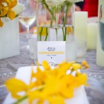
White floral orbs graced the ceremony and cocktail hours along with the visually delightful bright yellow. Yellow callas presented in clear fishbowls added another unique floral design to the list by Bellissima Floral.

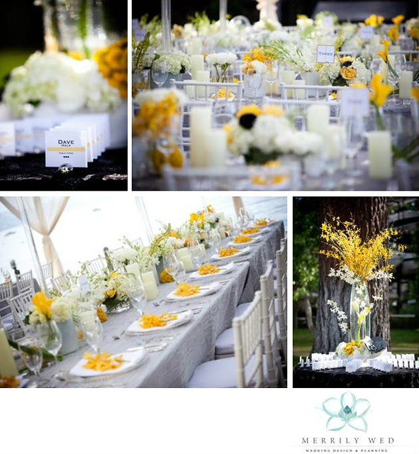
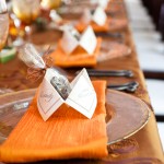
The clever yellow dot motif popped up again on the escort cards and table numbers. The center of the long dining tables overflowed with white pillars, hydrangea, orchids and callas. More pops of the bright yellow awaited each guest at their place setting.

Guests dined with an incomparable lakeside view under a modern and romantic open air tent, with sheer swagging and twinkle lights draping over their heads.

Hollye of Hollye Schumacher Photography captured every detail of this stunning wedding including the perfect sunset kiss that delighted the guests.

This isn’t the only glimpse of this wedding you will see, there is lots more to come of this gorgeous wedding… stay tuned!
xxxx
Tahoe Signature of Style,
xxx
 xxx
xxx
xxx
xxxxxx
x
xxx
Nov 7, 2012
Skimming through the thousands and thousands of photos we have of our events through the years, it struck me the range of colors that presented itself. Why not put together a handy dandy little guide to the secret meaning behind each color? Done, and so much fun selecting the right photo to represent each color from our past Merrily Wed weddings…
I never know what colors my next client may fancy and the opportunity to do something new is one of my favorite aspects of my job. Even with the same basic color palette, little twists and adjustments to the lead colors make every wedding different. For example, one year I had two clients with the same color palette and the same wedding day (believe it or not!).
The primary colors were navy and green yet one bride leaned towards kelly green and the other towards a spring chartreuse green. This is where the similarities stopped and the individual personalities of the wedding couples took over.
In fact, both of these weddings were so detailed, original and beautiful, they both landed spots in national and regional publications – Destination I Do Magazine and The knot Northern California Magazine.
This colorful visual guide below will show you what your favorite color means, what it may say about your personality and how the colors you select for your wedding color palette can influence the overall feel of your wedding day.
xxxx
 Red:
Red:
Red is the most intense color of the color wheel. Red stimulates energy as well as increases enthusiasm. Red symbolizes love, passion, courage and rage. Red also emits a sense of protection from anxiety and fears. If red is your favorite color you are passionate, maintain a busy lifestyle, desire strength and may be a risk taker.
x
xxxxx
 Pink:
Pink:
Pink is fun and exciting, some shades of pink can have almost the same energy as red. Red is passionate without being an overly aggressive hue. Pink is the color of happiness. Pink stimulates energy, encourages action and confidence. If pink is your favorite color you tend to be calm, sensitive and sympathetic. You are also compassionate towards others and dislike controversy.
xxx
xxx
 Orange:
Orange, a close relative of red, radiates warmth and energy. Orange stimulates appetite, socialization, as well as activity. If your favorite color is orange you are friendly, confident and full of energy. You balance your life with business and pleasure and enjoy both!
xxxxxx
 Yellow:
Yellow shines with optimism, enlightenment and happiness. Yellow is mentally stimulating and encourages communication. Yellow will increase optimism, energy, as well as spark creative thoughts. If yellow is your favorite color you are creative, intelligent and happiness comes naturally to you.
xxx
xxx
 Green:
Green occupies more space in the color wheel than any other color and is the second most popular favorite color. Green is a large contributor to the colors of nature. The color green is seen as tranquil and refreshing, with a balance of cool and warm hues. Most shades of green are known to be physically and mentally relaxing. If green is your favorite color you enjoy the nature that surrounds you and love spending time in the outdoors. You also enjoy calming your loved ones, as well as helping the less fortunate.
 Teal:
Teal:
Teal has the calming effect of both green and blue. Teal represents sophistication, generosity and creativity. Teal encourages communication as well as creativity. If your favorite color is teal you tend to be sensitive, intellectual, imaginative and charming. You also tend to be self-reliant and independent.
xxx
xxx
 Blue:
Blue:
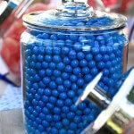
The color blue is the most common favorite color in the world. Blue is seen as trustworthy, dependable and committed. It invokes rest and can cause the body to produce chemicals that are calming. Not all blues are serene, bright blues can become dramatic and cause exhilaration. Blue is the least gender specific color, it appeals equally to both genders. If your favorite color is blue, friends find you to be very trustworthy and patient. You are also conservative and love to have stability in your life.
xxx
 Navy:
Navy:
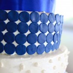
Navy symbolizes wisdom, self-mastery and spiritual realization. Navy, being a shade of blue, increases communication within yourself. Navy develops intuition, increases solitude and lets you focus on personal issues. If navy is your favorite color you are spiritual, intuitive and intelligent. You are also self-reliant and tend to take on responsibility.
ccc
xxx
 Purple:
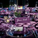
Purple balances red’s stimulation and blue’s calming effect. With a sense of royalty, purple is a color often well liked by very creative personalities. Purple is uplifting, calms nerves, as well as encourages creativity. If purple is your favorite color, you desire respect, power and often tend to be sentimental.
xxx
xxx
 White:
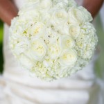
White projects purity, neutrality and cleanliness. The color white encourages clarity and enables fresh beginnings. White also encourages clearing clutter and purifying thoughts and actions. If white is your favorite color, you prefer a peaceful surrounding and like to be surrounded by truth and innocence.
xxx
xxx
 Grey:
Grey:
Grey is the color of knowledge, wisdom and intellect. Grey is also known as the color of compromise because it is a mixture of powerful black and pure white. Grey can sometimes be unsettling because of this compromise, but can also create expectations. If grey is your favorite color you constantly look for peace and composure. You have good business abilities and tend to work hard, sometimes without reward.
 Black:
Black is authoritative, powerful, formal and evokes strong emotions. The color black can create a sense of potential and possibility. If black is your favorite color you are classy and others perceive you as a powerful individual. You are very in tune with your emotions and can be spontaneous.
xxx
xxx
 Brown:
Brown symbolizes stability, reliability and approachability. Brown is the color of earth and is affiliated with being natural and organic. Brown creates a feeling of wholesomeness, stability and orderliness. If your favorite color is brown you are dependable, patient and reliable. You also tend to not like impulse, because you are organized and everything is well planned.
xxx
xxx
 Champagne:
Champagne represents the basics, the essentials. Champagne incorporates the warmth of brown with the crispness of white. Champagne creates a feeling that is calm, relaxing and creates a feeling of simplicity. If your favorite color is champagne, you are conservative, dependable and friendly. You also tend to be a perfectionist and like everything to be precise.
xxxxx
xxx
Colors reveal a lot more than just adding some eye candy to an area or object. Keep in mind that a single description may not fit you perfectly and it may be a combination of colors that describe you best.
You may consider these meanings when selecting the color palette for your wedding to instill the feeling that you desire. More importantly though, just have fun with it! Can’t go wrong with your favorites and your wedding will be a true reflection of yourself!
xxxx
Tahoe Signature of Style,
xxx
 xxx
xxx
xxx
xxxxxx
x
xxx
Oct 17, 2012
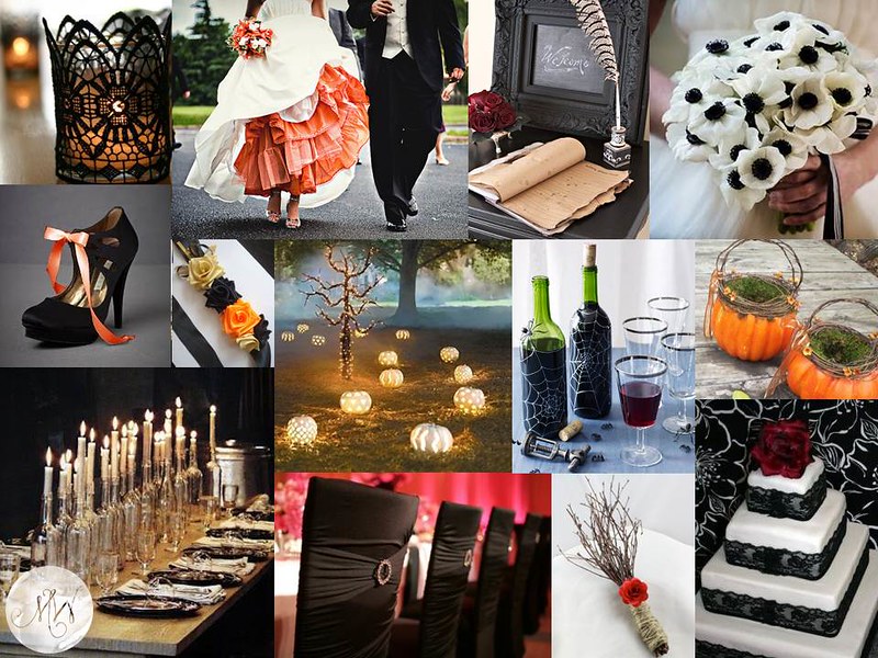
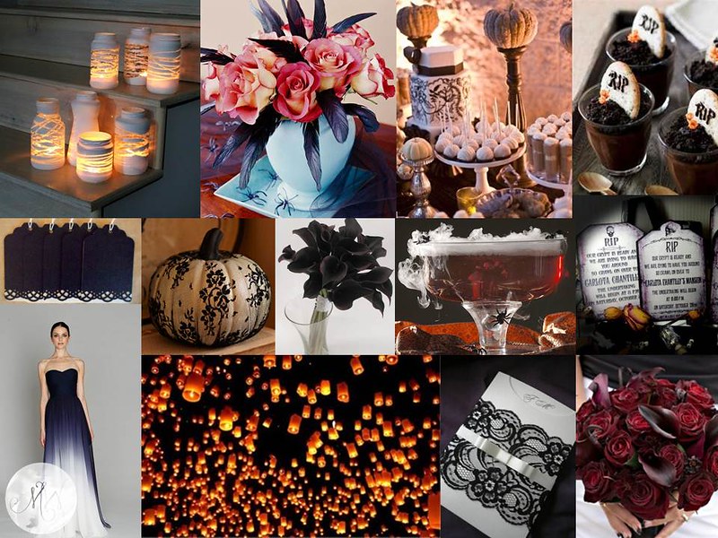
What if you were planning a Halloween wedding? So for fun (since I probably will never plan a real wedding on Halloween or face my son disowning me for missing trick-or-treating), I thought What If?
The challenge is to create an elegant event, and dare we say romantic, without it feeling like a kid’s Halloween party… but at the same time not to completely lose the obvious inspiration of the hallowed holiday.
What if… we used coffins for benches to sit on during the ceremony? What if…. lighted pumpkins lined your aisle?
What if… your flower girl used a pumpkin to toss her petals from?
What if… we used tombstones to direct guests to various vignettes?
What if… we used a smokey cauldron to serve the special drink?
What if… you dyed your crinoline a fall orange? What if… you dressed your bridesmaids in black and white?
What if… we garnished passed appetizers with mini-tombstones monogrammed with your initials?
and What if… for your grand exit your guests released glowing wish lanterns into the Halloween night sky…
xxx


Top Board, Credits from Top Left to Right – ZoesApartmentBlogspot, BrassPaperClip, BHG, HendCyber; Middle Left to Right – ArsenicWitcheryBlogspot, Etsy Artist Ivanna, Pinterest, WomansDay, Etsy Artist AprilHillerDesigns; Bottom Left to Right – Remodelista, JubileeLauEvents, BridalSnob, Juxtapost
Bottom Board, Credits from Top Left to Right – TheForgeStyleBlogspot, BHG, DevaWeddings, Pinterest; Middle Left to Right – Etsy Artist FlourishingAgain, BHG, WeddingObsession, Squidoo, Etsy Artist DamnFrenchDesserts; Bottom Left to Right – Indulgy, ArsenicWitcheryBlogspot, Pinterest, theKnot
Happy Halloween!
Tahoe Signature of Style,
xxx
 xxx
xxx
xxx
xxxxxx
x
xxx
Sep 19, 2012 |
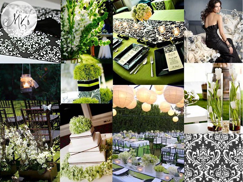
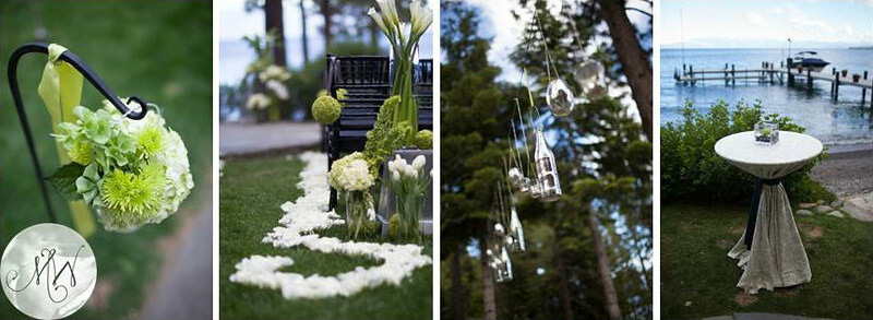
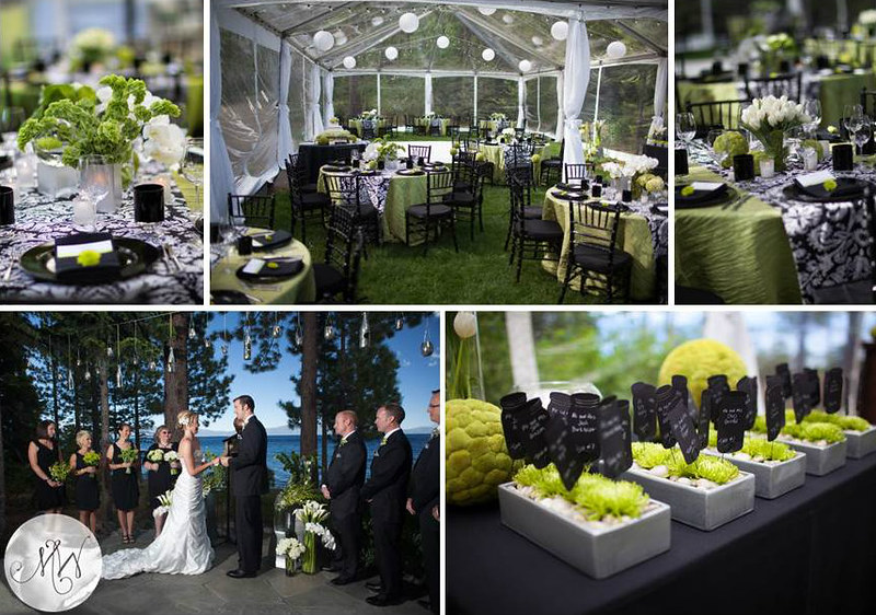
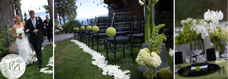
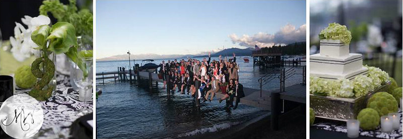
A few months ago we shared the inspiration board we created for Mendy & Jim, one of our Lake Tahoe weddings, on our Merrily Wed Facebook page. We have been eagerly awaiting to share with you the reveal of their June wedding! Here’s the beautiful board for those who missed it and then below, the gorgeous lakefront private estate wedding…
xxx

xxx
If you didn’t know, Plan B is for Better. At least it is in our book now. As an unseasonably cold front came through and decided to stay we rethought, reworked and revamped our plans of the past year in a mere 2 days. Not only does Plan B stand for Better but for Beautiful too. No one would have ever known that this was not the original plan, except for now as I am spillin’ ‘da beans!
xxx

xxxxBringing in clear tents and tent heaters allowed Mendy & Jim’s chartreuse green, black and pewter silver palette to shine through.

An overall modern yet classic wedding style without forgetting the natural stunning setting…

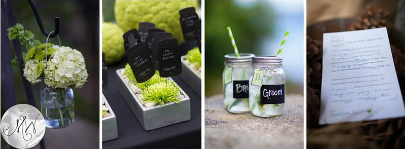
In nod to these mason jar aficionados, we had these subtly popping up in all the expected (and unexpected!) places. Their Mad Libs sign in was also a true testimony to this couple’s fun and playful nature. And their guests couldn’t help but to fill out more than one!x


xxx
A surprise serenade to Mendy’s pure delight by Jim was one of the unforgettable moments during the reception – another was a guest busting out “the worm”! Married, happy and warm was how these newlyweds left into the night along with all their ecstatic guests!
xxx
Pleasure to work side by side with – Floral Design by Bellissima Floral and Photography by Ciprian Photography.
xxx
Tahoe Signature of Style,
xxx
 xxx
xxx
xxx
xxxxxx
x
xxx
Aug 9, 2012
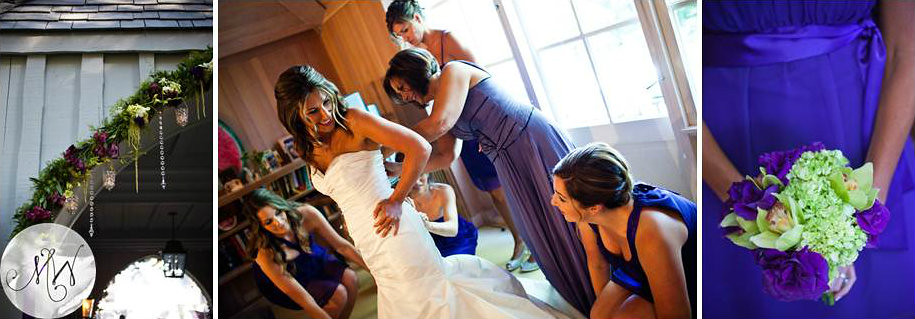
I love color. I love every single color for different reasons and how certain color combos resonate with each other. Thanks to Amanda I met purple again and in the full regal form that it deserves.
With a sense of royalty, purple is a color often well liked by very creative personalities. Purple is uplifting, calms nerves, as well as encourages creativity. If purple is your favorite color, you desire respect, power and often tend to be sentimental.
For Amanda, there couldn’t be enough purple (a lady after my own four year old’s heart) and so here was the design challenge to bring in purple, purple, purple without being TOO much.
Mix in a little whimsical sophistication and we had Amanda’s dream Lake Tahoe wedding: Purple M&Ms – check. Purple pillars – check. Purple linen – check. Purple lights – check. Purple lounge – check.


xxxx
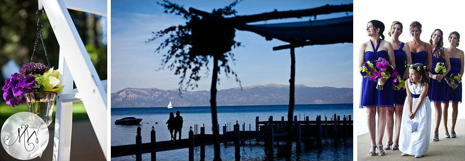
Married last September with the Lake as their very close backdrop, Amanda and Jeff’s guests were treated to a spectacular twilight ceremony just inches from the water.
xxxx


ccc
Silver and spring green played a supporting role to purple in the little details: beaded clear chargers (which allowed the oh-so-fun purple leafed linen to peep through), dangling crystals, metallic balls in the vases, pin cushions on the cake, mercury vases randomly placed, the candy station…
xxx

xxx
Amanda and Jeff’s black tie wedding began with a sundown ceremony and quickly moved from the lakeside vows to the sprawling reception tent that was complete with multiple vignettes for the guests to enjoy. Playful glowing cubes in the centerpieces to up lights on trees to a beautiful light-patterned dance floor made the most of the evening reception.
xxx

xxx
A night that ended with endless dancing, lost shoes (?!) and grins from ear to ear… Congratulations to the beautiful couple, Amanda & Jeff!
Florals by Art In Bloom.
xxx
Tahoe Signature of Style,
xxx
 xxx
xxx
xxx
xxxxxx
x
xxx
 xxx
xxx